
Mobile-Friendly Forms: Boosting Your Conversion Rates
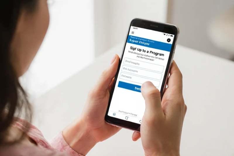
In the online world, mobile-friendly forms are essential for online marketers. These type of forms are specifically created for phones and tablets. They help you connect with your audience effectively. This article will explain why mobile-friendly forms matter and how they can improve your opt-in mailing list conversion rates.
Why Mobile-Friendly Forms Matter
1. Increased Accessibility: Many people use their phones to browse the internet. Having forms that are friendly to mobile devices guarantees that all individuals can conveniently access the content you provide.
2. Better User Experience: Forms that are easy to fill out on mobile devices lead to happier users. A good experience encourages them to complete the form.
3. Higher Engagement: When forms are mobile-friendly, users are more likely to engage with your content. This can lead to more sign-ups for your mailing list.
4. Improved SEO: Search engines favor mobile-friendly websites. This means your site can rank higher, attracting more visitors.
How Mobile-Friendly Forms Improve Conversion Rates
Step 1: Simplify Your Form Design
- Limit Fields: Keep your form short. Ask only for essential information, like name and email address. Fewer fields mean less effort for users.
- Include Clear Labels: Any field should have a clear label. This helps users understand what information you need.
Step 2: Optimize for Touch
- Larger Buttons: Make buttons big enough for fingers to tap easily. This reduces frustration and encourages users to click.
- Spacing: Ensure there is enough space between fields. This prevents users from accidentally tapping the wrong field.
Step 3: Test Your Forms
- Cross-Device Testing: Check how your forms look on different devices. Ensure they work well on various screen sizes.
- User Feedback: Ask friends or family to test your forms. Their feedback can help you identify issues.
Step 4: Use Mobile-Friendly Design Elements
- Responsive Design: Use a responsive design that adjusts to different screen sizes. This ensures your form looks good on any device.
- Visual Appeal: Use colors and fonts that are easy to read. A visually appealing form can attract more users.
Step 5: Implement Auto-Fill Features
- Auto-Fill Options: Allow users to auto-fill information where possible. This saves time and makes the process easier.
- Social Media Logins: Consider allowing users to sign up using their social media accounts. Sign-ups can improve and the entire process can be faster.
Step 6: Monitor and Analyze Performance
- Track Conversion Rates: Use analytics tools to track how many users complete your forms. This allows a better understanding of what will and will not work.
- A/B Testing: Run through and test a variety of forms. Change one element at a time to see what improves conversion rates.
Mobile-friendly forms are crucial for online marketers. They enhance user experience, increase accessibility, and improve conversion rates. By following the steps outlined above, you can create effective forms that encourage more sign-ups for your mailing list. Remember, a well-designed form can make all the difference in your marketing efforts.
